Persona
Requesting official
- Job to be done
- “Get this opinion translated into all languages before the plenary.”
- Pain points
- Doesn’t know where a request is. Has to email to ask for a change.
Translation workflow · Internal product · CoR & EESC
Outcome
One tool where officials request translations of official and legal texts, follow every step, and ask for corrections
Every opinion, legal text and official document at the Committees has to exist in the EU languages. Officials send each text to translation, translators deliver it, and reviewers check it before it is published. If something is wrong, it goes back for correction.
Artemis supports that whole job. Officials create a request, translators and reviewers work on it, and everyone can see where each document is. I designed the interface with the CoR & EESC design system, tested it with users, ran accessibility tests, and the front end was built in Angular.
BProblem & users
Translation requests carry deadlines tied to plenaries and meetings. People need to know at a glance what is waiting, what is late, and who is working on it, across hundreds of requests.
Persona
Persona
Persona
CUse cases & user flow
| Use case | Who | Where in Artemis |
|---|---|---|
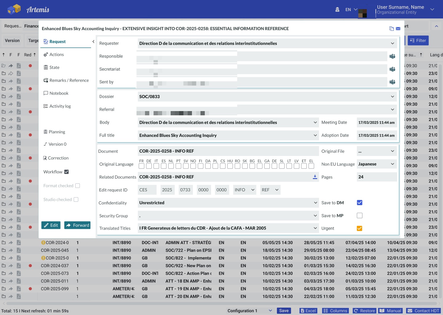
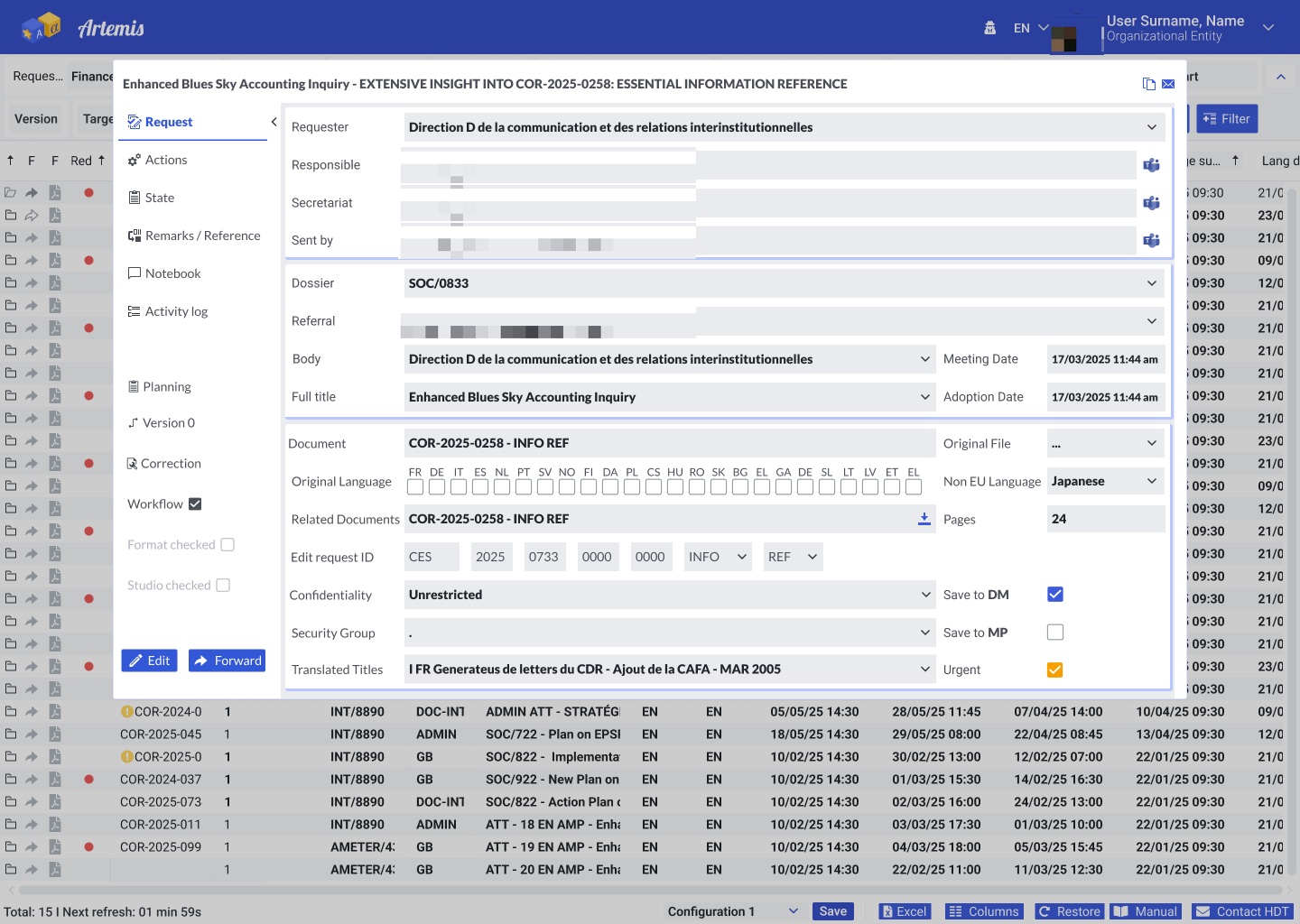
| Request a translation of an official or legal document | Requesting official | Request: requester, dossier, document, original language, target languages, pages, deadlines, confidentiality, urgent |
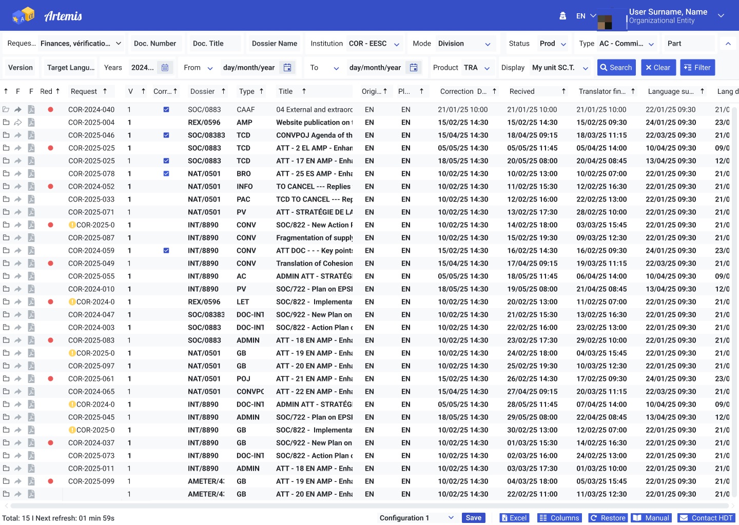
| Follow where a request is | Officials, admins | List with status, dates and a red dot for late items. State, Planning and Activity log in the request |
| Deliver and review the translation | Translators, reviewers | Workflow, Format checked, Studio checked, Version |
| Ask for a modification | Officials, reviewers | Correction, Remarks / Reference, Notebook |
| Plan the unit’s work | Admins | Filters, saved configurations, columns, Excel export, auto refresh |
DUsability review
I reviewed the design against the 10 usability rules of Nielsen Norman Group and the WCAG 2.2 AA accessibility standard. Each row shows how the design answers each rule.
| Usability rule | How the design answers it |
|---|---|
| Visibility of system status | Red dot for late items, status column, “Next refresh” counter, Activity log in each request. |
| Match with the real world | Labels use the Committees’ own words: dossier, referral, adoption date, secretariat. |
| User control and freedom | Edit and Forward always at the bottom of the request; Correction to send work back. |
| Flexibility and efficiency | Saved configurations, choose columns, sort, Excel export for admins. |
| Aesthetic and minimalist design | The long request is split into tabs on the left, so each screen shows one group of fields. |
| Help | Manual and “Contact HDT” (helpdesk) always in the footer bar. |
EUser testing
Moderated, think-aloud sessions with officials, translation staff and admins from both Committees. Each person did the core tasks on the prototype; admins also tested planning and configuration.
| Task | Who | What we looked at |
|---|---|---|
| “Request a translation of this opinion into French and German.” | All 9 | Finding the fields, choosing languages, marking it urgent. |
| “Which of your requests are late?” | All 9 | Seeing the red dot and status, filtering by unit. |
| “Ask for a correction on this translation.” | All 9 | Finding Correction and explaining the change. |
| “Set up a view for your unit and export it.” | 3 admins | Filters, columns, saved configuration, Excel. |
Officials and translators need few fields and a clear status. Admins need more control: filters, exports and saved views. The design gives both: a simple default, with power tools in the toolbar and footer.
FAccessibility testing
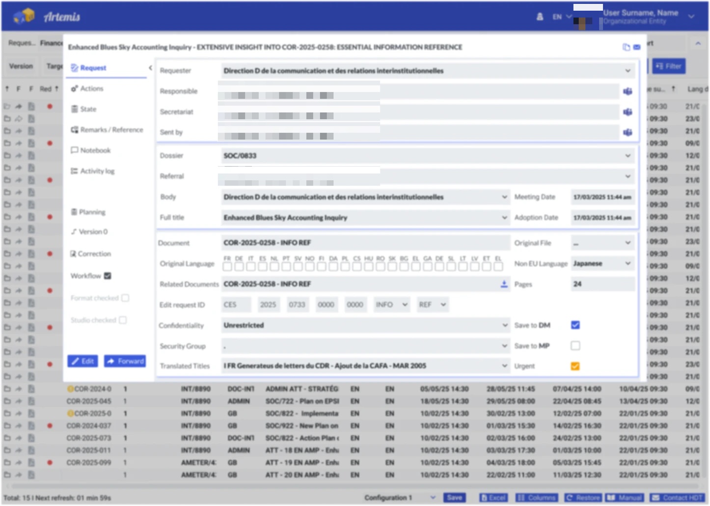
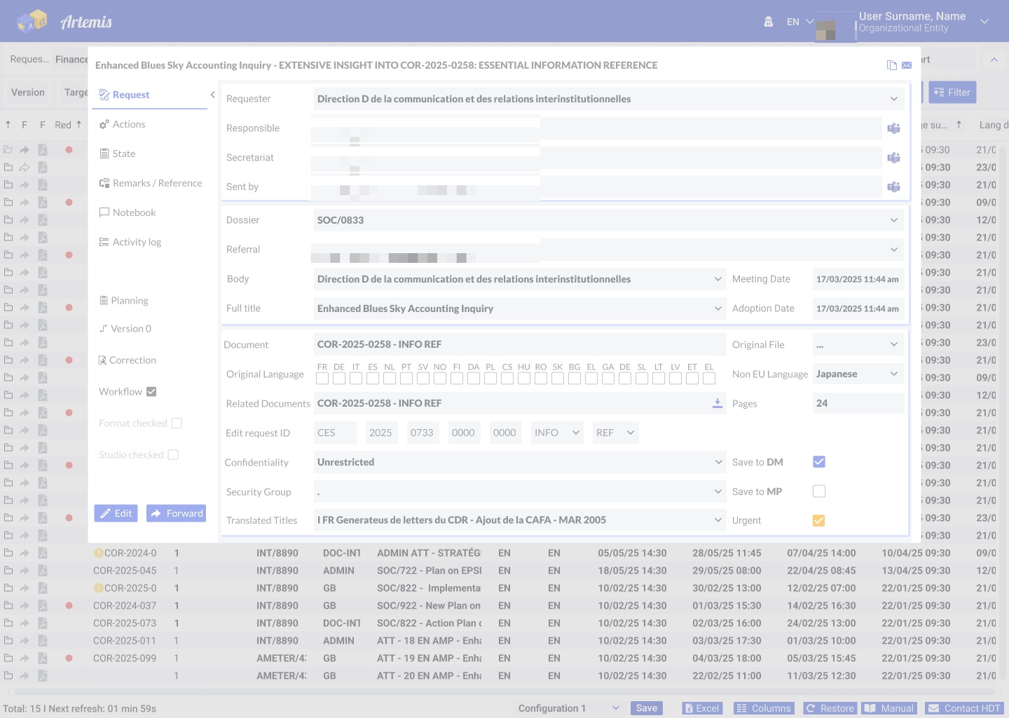
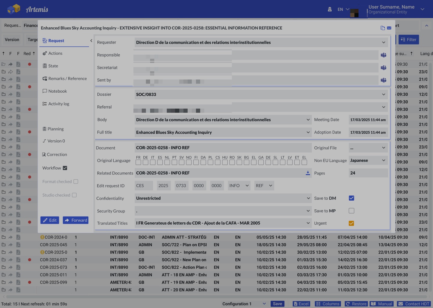
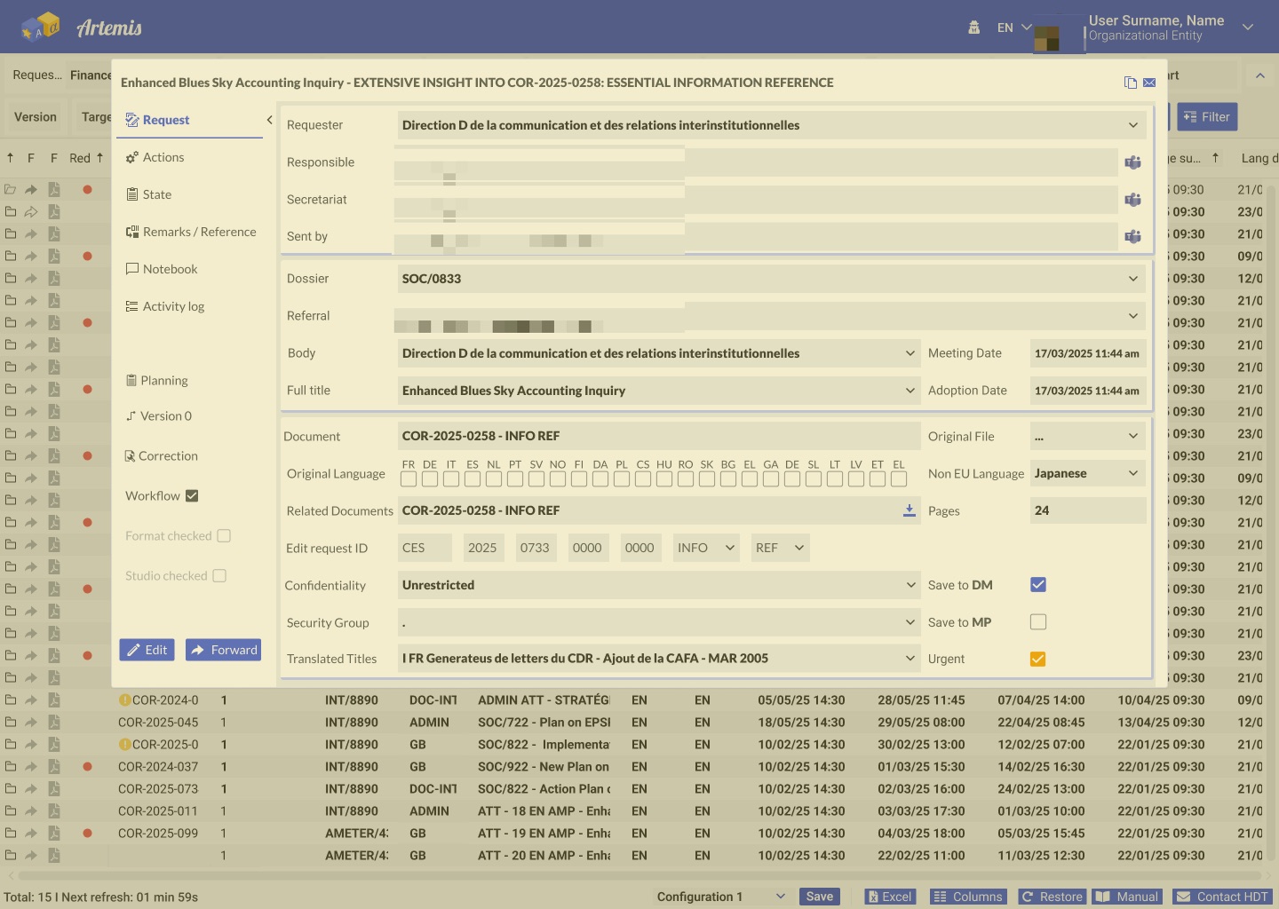
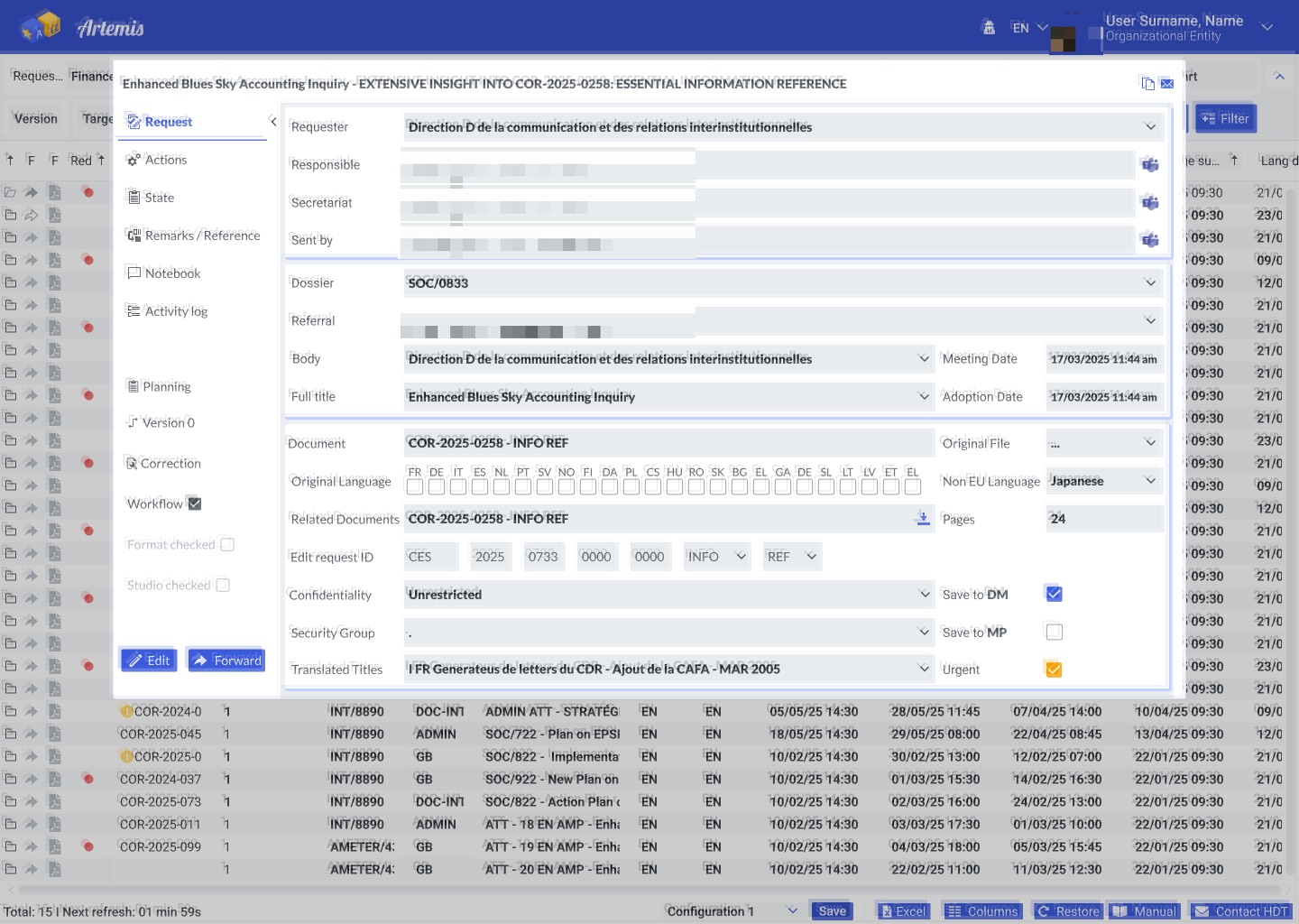
Artemis is used all day by people with many kinds of vision. I tested the request screen with vision simulations, checked contrast, and checked the keyboard and screen reader path, against the WCAG 2.2 AA accessibility standard and EN 301 549. Names are hidden in the images.
GScreens & design system
Two cubes: blue with an “A” and a star for the source text, yellow with an alpha for the translation. One language turning into another.
Blue app header (#2C4390), data grid, filters, tabs, checkboxes, buttons and the request dialog all come from the CoR & EESC design system, so Artemis looks and works like the other internal apps.
HOutcome & next steps