← Back to portfolio

Mobile banking · AI · Design challenge

Marés: ask it, approve it

UX, UI & design system · solo project
Flow
6 screens, 1 full journey
Themes
Light + dark
Accessibility
WCAG 2.2 AA target
Method
Lean UX · Sprint 0

Outcome

From one sentence to an approved savings plan, with the customer in control at every step

People open a banking app with a goal, not a product name. Menus and jargon make them guess, or give up. Marés lets customers type what they want in plain words. The AI explains the numbers, suggests a plan, and nothing happens until the customer approves it.

Tools: Figma variables and components, a clickable prototype, Plus Jakarta Sans, and a React handoff spec. This is a design challenge, not a real bank.

Banking apps make you learn products before you can act

Sprint 0 turned the brief into a problem statement, four testable hypotheses and two proto-personas. The personas are assumptions to test, not research findings.

Sprint 0 outputs

  • Problem statement: customers arrive with a goal but must find the right product first.
  • Success criteria: start without a menu, understand the numbers, change the plan easily, approve with confidence.
  • Four hypotheses to test (see the test plan below).
  • Journey map in five stages: Ask, Understand, Plan, Review, Done, including the error path.

Proto-persona · assumption

Goal-first saver

Job to be done
“Help me save for a holiday next summer without hurting my monthly bills.”
Pain points
Doesn’t know which product to open. Product names and menus feel like work.

Proto-persona · assumption

Cautious checker

Job to be done
“Show me exactly what will happen to my money before I agree.”
Pain points
Doesn’t trust an AI that acts alone. One unexplained figure feels risky.

Is it easy to use, and accessible to everyone?

I reviewed the six screens against the 10 usability rules of Nielsen Norman Group and the WCAG 2.2 AA accessibility standard. Each row shows how the design answers each rule, and what still needs checking with users.

Usability review of the Marés flow.
Usability ruleHow the design answers itTo check in testing
Visibility of system statusThe AI says what it is doing while it reads the data. Status tags show if a plan is comfortable, slow or tight.Do people notice the status tag before they move on?
Match with the real worldCustomers start with their own words (“save for a holiday”), not product names.Does the AI understand the way people really phrase goals?
User control and freedomNothing happens until the customer approves. The chat stays one tap away while editing the plan.Can people go back and change the amount without starting over?
Recognition rather than recallSuggestion chips on Home and a review screen that lists every effect before approval.Are the chips the goals people actually have?
Error preventionA safe range on the slider and a consent checkbox before the approve button enables.Do people understand why the approve button is disabled?
Accessibility and contrastColour is never the only signal: tags use icon and text, the money bar has a text legend. 44 px targets and a visible focus ring.Contrast of every colour pair, keyboard, VoiceOver and TalkBack.

Test plan: one task per hypothesis

Status: planned, not run yet. Round 1 uses the clickable prototype with 5 participants in moderated, think-aloud sessions on a phone. Results will replace this plan after the round.

Hypotheses, test tasks and success criteria for round 1.
HypothesisTaskSuccess means
1 · Starting in plain words is easier than a menu“You want to save for a holiday. Start from the home screen.”4 of 5 start the goal without looking for a menu.
2 · A safe range builds more trust than one figure“How much can you save each month? Explain why.”4 of 5 explain the safe range in their own words.
3 · Controls beside the chat keep context“Make the plan finish two months earlier.”4 of 5 change the plan without leaving the screen.
4 · A full review makes approval feel safe“Before you approve, tell me what will happen.”5 of 5 name the amount, the date and the account.

Accessibility tests

  • The whole journey by keyboard only.
  • VoiceOver on iOS and TalkBack on Android, including chat updates read aloud.
  • Contrast check of every colour pair in light and dark mode.
  • At least one participant who uses assistive technology every day.

After the round

Rate each problem by how often it happens and how serious it is, fix the top issues in the prototype, and run round 2 with 5 new participants. I don’t show results that I haven’t measured.

Six screens, one complete flow

From a sentence to an approved savings plan. The background “tide” rises with the account balance as a calm, decorative signal. The balance is always written as text too.

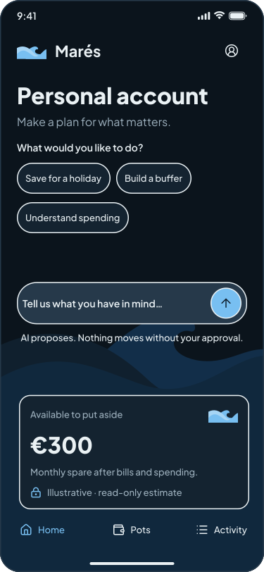
Home screen with account balance, goal suggestions and a message box
1 · HomeGoal chips and a message box replace the menu.
Ask screen with a savings goal and Marés explaining what it is checking
2 · AskThe AI says what it is doing while it reads the data.
Understand screen summarising monthly bills, spending and available savings
3 · UnderstandA text legend backs up every colour.
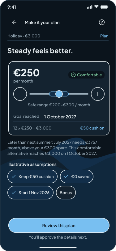
Plan screen with a monthly savings amount, timeline and options to adjust
4 · PlanChange the amount and timeline, with the chat one tap away.
Review screen listing the transfer details before approval
5 · ReviewEvery effect is listed before approval.
Done screen confirming the new monthly savings plan and the next transfer
6 · DoneA clear confirmation and next step.
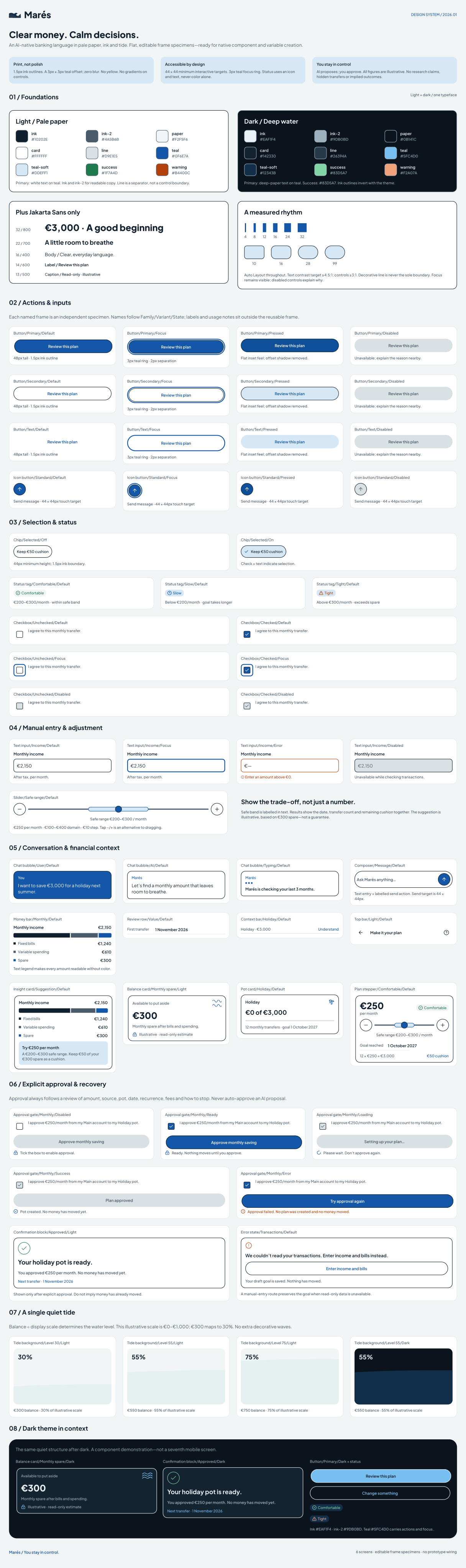
Marés system specimen board with typography, colours, patterns and product screens

System specimen board

Typography, colour, patterns and screens in light and dark mode.

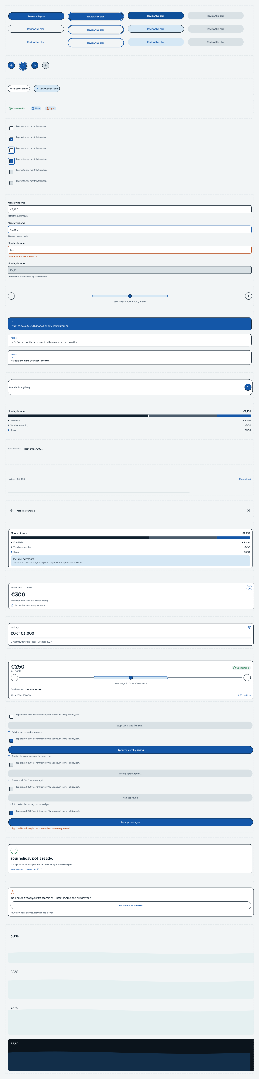
Marés component library with reusable components and their states

Component library

Reusable components with variants and states, built from Figma variables.

Colour & type

  • Ink#10202E · text, surfaces
  • Blue#A7D8F3 · actions, focus
  • Deep blue#6FAED7 · selected, tide
  • Ice blue#DDF1FF · backgrounds

One typeface, Plus Jakarta Sans, in weights 400–800 for titles, body text and large money figures. Light and dark modes are Figma variables.

Foundations & components

Spacing 4–32 px, corner radius 10, 16, 28 and pill, 1.5 px outlines, a flat offset shadow, a 3 px focus ring and 44 px minimum touch targets.

ButtonChipStatus tagSliderChat bubbleMessage boxMoney barPlan stepperReview rowApproval gateSavings potTide background
How the Figma component maps to React props.
FigmaReact propNotes
Variant status: comfortable · slow · tightstatusComes from the amount compared with the safe range. The tag has an icon and text.
Slider value, min, max, stepvalue min max stepWraps the native range input, read aloud as “€250 per month”.
Safe rangesafeMin safeMaxComes from the insight service and is checked on the server.
Light / dark themetokensNo prop. Tokens switch with the mode.

If the viewer is empty, use the “Open in Figma” button at the top of the page.

What I delivered, and what comes next

Delivered

  • A clickable prototype of one full journey with a real state change: approval creates a savings pot.
  • A design system with light and dark variables, components and states.
  • A heuristic review and a ready-to-run test plan with success criteria.
  • A React handoff spec for the most complex component.

Next steps

  • Run test round 1 with 5 participants.
  • Check contrast of every colour pair in both modes.
  • Fix the top issues and test again with 5 new participants.
I used Claude for flow ideas, copy, documentation and background explorations. I kept what helped the user and rejected the rest.
ExplorationDecisionWhy
Soft contour linesRejectedNot the feeling I wanted.
3D sea with sunRejectedThe yellow and lines competed with the content.
Tide = money in the accountKept the ideaCalm and meaningful, and always repeated in text.
Neumorphic sea and UIRejectedSoft shadows make edges hard to see for low-vision users.
One calm waveChosenLow distraction, and motion stops with reduced-motion settings.