Institutional, not bureaucratic
Brand foundations come from the EU emblem and the joint identity. The interface stays calm and trustworthy, and the content leads.
Design system documentation · Version 2026.1
One shared language for the digital services of the European Committee of the Regions and the European Economic and Social Committee: brand foundations aligned with the EU emblem, design tokens, and accessible components for data-dense institutional applications.

01 · Foundations
Every component and pattern is checked against these five principles. They come from the people who use these applications every day: members, staff, translators and HR teams.
Brand foundations come from the EU emblem and the joint identity. The interface stays calm and trustworthy, and the content leads.
WCAG 2.2 AA and EN 301 549 are built into every component, so product teams don’t have to add accessibility at the end.
Layouts allow for 24 official languages: labels can grow by 40%, dates follow DD/MM/YYYY, and nothing depends on English word length.
Expert users scan large data sets. Grids, filters and dashboards keep information dense, with clear hierarchy and plenty of white space between groups.
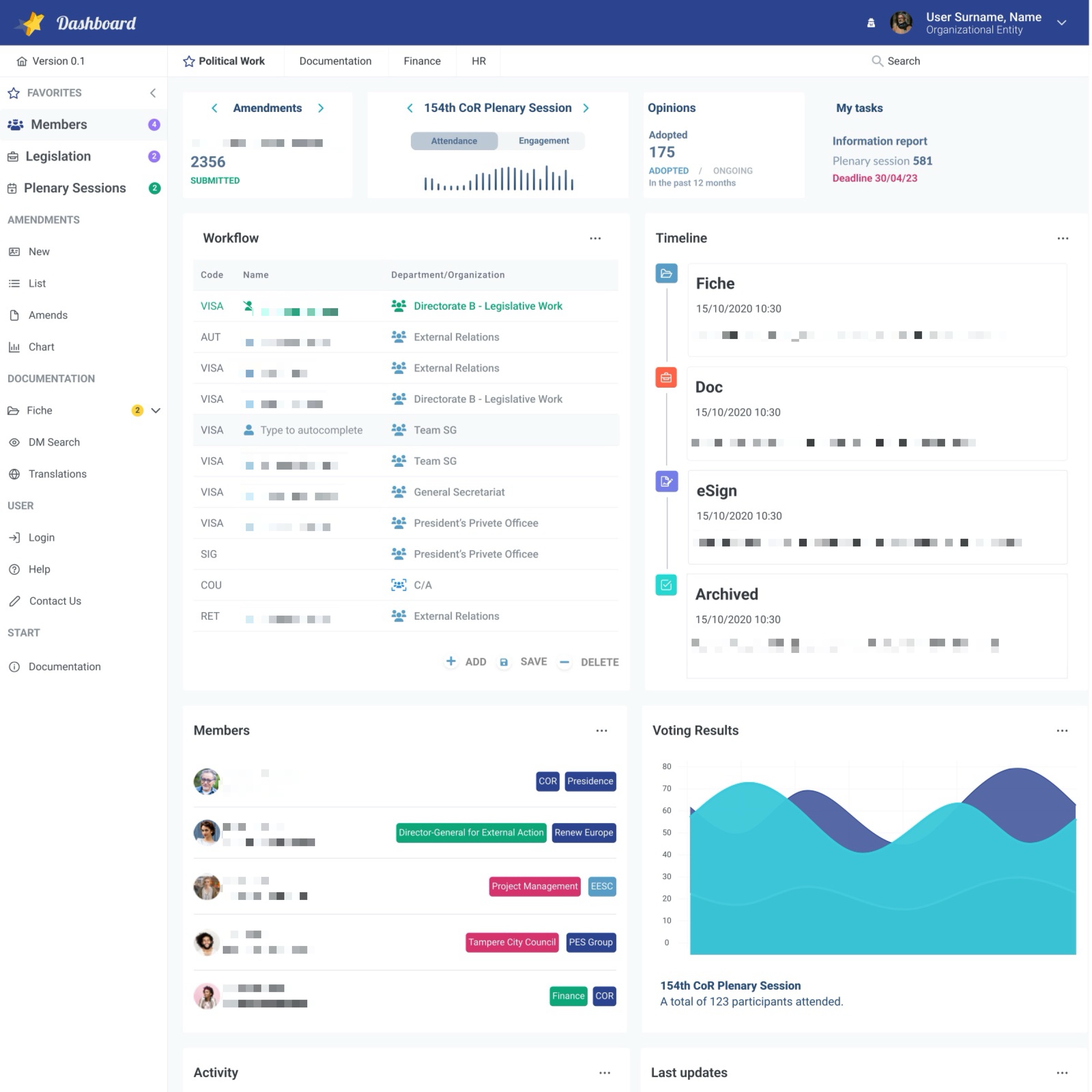
Artemis, Opinions, the members dashboard, HR Forms and DM Search share tokens and components, whether they are built in HTML, React or Angular.
Every request, opinion and document shows where it is, who owns it and what comes next: status tags, timelines and refresh indicators.
02 · Foundations
Both committees build their logo around the EU flag. The rules below come from the official CoR and EESC brand guidelines, written for the people who ship products: what to use, how big, how much space, and what never to do.
The CoR logo has three parts: the EU flag, the sound waves around it and the name of the Committee. The flag is always centred in the space it sits in.



The EESC logo has three parts: the EU flag, the name of the Committee and curved lines that stand for its three groups: Employers, Workers and Civil Society Organisations.





| Rule | CoR | EESC |
|---|---|---|
| Standard logo, min. width | 70px | 86px |
| Horizontal logo, min. width | 150px | 150px |
| Logo in an app header, min. width | 149px | 110px |
| Mute logo, min. width | 50px | 50px |
| EU flag, min. width | 30px | 30px |
| Clear space around the logo | 4X on every side (X = 1/8 of the flag height) | Half the flag height on every side |
| Free space in headers and tables | At least 10px | At least 10px |
| Logo colours | #2C4390 #589DC7 #FFD661 | #2C4390 #FFED00 #B1B1B0 #525251 |
| Other languages or a new format | Ask the CoR publications service | Ask the EESC Visits and Publications Unit |
Pick the version that keeps every part of the logo visible and the name easy to read. Use plain colours only.
Brand colours from each committee’s guidelines. For text, tags and buttons, use the accessible tokens in the Colour section. Some brand colours are too light for white text.
Corporate
Commissions
Corporate
Groups
Sections and services
03 · Foundations
One header pattern for every CoR and EESC product. The app name sits on the left and the Committee logo on the right, so people always know which service they are in and who runs it. Switch the Committee and turn on the measurements to see the spec.
 Artemis

 HR Forms
For dense internal tools. The logo stays at or above its minimum width (CoR 149px, EESC 110px), with 10px free above and below.

Under 600px the mute logo replaces the full logo. It must be at least 50px wide, and the full name stays in the menu and the footer.
On public websites the logo sits top-left in colour on white, and links to the home page. The language menu always stays visible: there are 24 languages.
| Header | Height | Side padding | Background | Logo version |
|---|---|---|---|---|
| External app | 80px + 50px breadcrumb | 20px | #2C4390 | Horizontal, white |
| Internal tool | 64px | 20px | #2C4390 | Horizontal, white |
| Mobile (under 600px) | 64px | 16px | #2C4390 | Mute, white |
| Public website | 96px | Page grid | #FFFFFF | Standard or horizontal, colour |
0 of 10 brand checks done
04 · Foundations
Brand colours carry identity; UI colours carry meaning. Every swatch shows its contrast with white and whether it passes WCAG for text. AA means safe for body text (4.5:1), Large means 18px bold or 24px and above only (3:1), and Decor means backgrounds and illustration only.
Commissions keep a fixed colour across Opinions, dashboards and charts, so users recognise them at a glance. Always show the commission name too, never colour alone.
05 · Foundations
Europea is the brand typeface, with Europea Narrow for dense tables and Arial as the fallback for Office documents and systems without Europea. Hierarchy comes from weight, size and spacing, never from colour or decoration.
Use ALL CAPS only for short labels and overlines (two or three words). Longer headings use sentence case. Never set body text in caps; it slows reading, especially in Cyrillic and Greek.
06 · Foundations
A 4px base unit. Components use 8 and 16px inside, sections use 24 to 48px between them.
xs4pxsm8pxmd16pxlg24pxxl32px2xl40px3xl48pxCompact · 375px
1 column, 16px gutters. Sidebar becomes a drawer; tables scroll horizontally.
Tablet · 768px
8 columns, 24px gutters. Two-column widgets.
Desktop · 1024–1440px
12 columns, 24px gutters, 240px sidebar. Dashboards use 2–4 widget columns.
Wide · 1920px+
Content capped at 1600px; data grids may use full width.
07 · Foundations
Outline icons on a 24px grid with a 2px stroke, shown at 16 or 20px. An icon always comes with a visible label or an accessible name; decorative icons are hidden from assistive technology.
08 · Components
Live components, built with the tokens above. Try them with a keyboard: every control has a visible focus ring.
09 · Components
Labels always sit above the field. Errors say what went wrong and how to fix it, and are linked to the field for screen readers.
10 · Components
Status tags, KPI tiles, data grids, timelines and lists for the data-dense work of institutional staff.
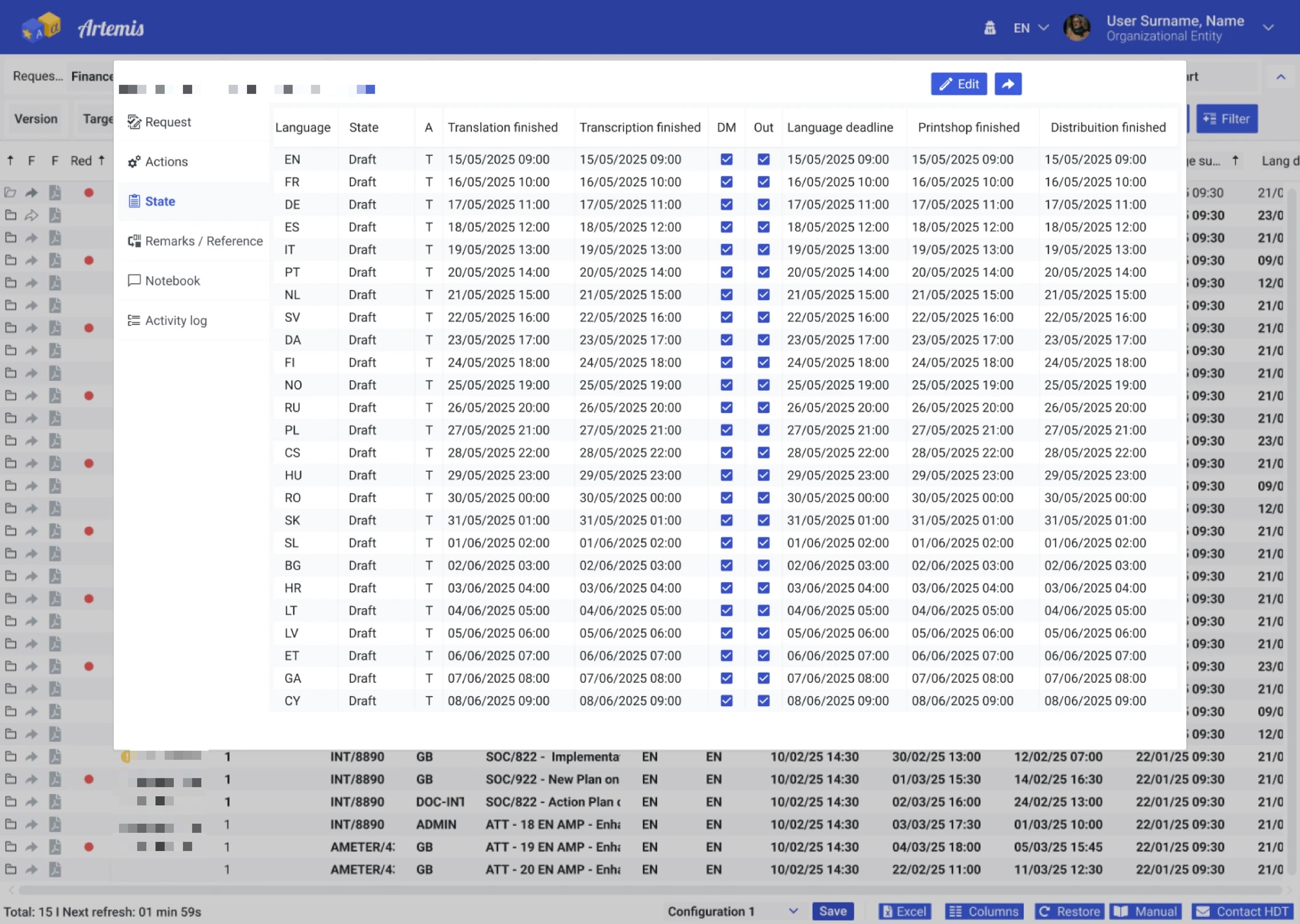
| State | Transcription finished | DM | Out | Distribution finished | |||
|---|---|---|---|---|---|---|---|
| DE | Submitted | 17/05/2025 11:00 | 17/05/2025 11:00 | 17/05/2025 11:00 | 17/05/2025 11:00 | ||
| EN | Finished | 15/05/2025 09:00 | 15/05/2025 09:00 | 15/05/2025 09:00 | 15/05/2025 09:00 | ||
| ES | Draft | 18/05/2025 12:00 | 18/05/2025 12:00 | 18/05/2025 12:00 | — | ||
| FR | Finished | 16/05/2025 10:00 | 16/05/2025 10:00 | 16/05/2025 10:00 | 16/05/2025 10:00 | ||
| IT | In translation | 19/05/2025 13:00 | — | 19/05/2025 13:00 | — | ||
| NL | Draft | 21/05/2025 15:00 | — | 21/05/2025 15:00 | — | ||
| PL | Late | 27/05/2025 21:00 | — | 20/05/2025 18:00 | — | ||
| PT | In translation | 20/05/2025 14:00 | — | 20/05/2025 14:00 | — |
Select a sortable column header to sort. The header stays visible while the grid scrolls, and the first column is a row header for screen readers.
| Code | Name | Department |
|---|---|---|
| VISA | Birmann Sophie (current step) | Directorate B · Legislative Work |
| AUT | Alves Catherine | External Relations |
| VISA | Bosh John | External Relations |
| SIG | — | President’s Private Office |
Richard Jones (C8012) updated the file.
Richard Jones uploaded Nat_eu_2023_doc.pdf.
Richard Jones signed the document.
Richard Jones saved the file to the archive.
11 · Components
Messages always pair an icon with text, and errors explain the next step.
The information report is due on 30/04/2026.
COR-2025-0258 was sent to 24 language units.
PL translation is not finished yet.
The file is larger than 20 MB. Compress it or split it into parts.
We couldn’t confirm your credentials for this application. Restart your browser and sign in again.
Request details open in a modal with vertical tabs. Focus moves into the dialog, Escape closes it, and focus returns to the button.
12 · Patterns
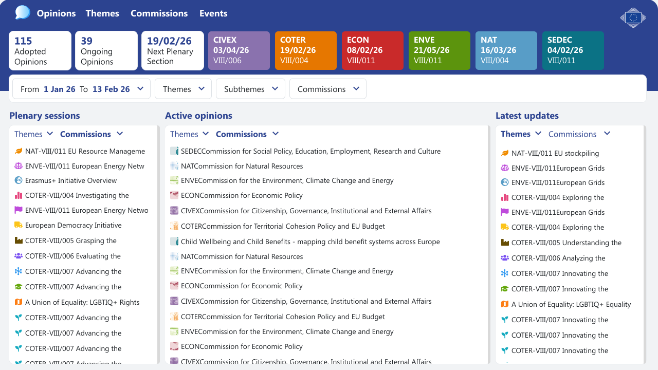
The components above, combined in the applications that use them. Select an image to open it full size.
13 · Quality
WCAG 2.2 AA and EN 301 549 are the baseline. Auditing the existing screens found colours that were too light for text; the system replaces them with darker tokens of the same hue.
| Used for | Before | After (token) |
|---|---|---|
| Active workflow step, success text | #0CA678 · 3.1:1 fail | --ui-success #0B6E4F · 6.3:1 |
| Secondary and helper text | #868E96 · 3.3:1 fail | --ui-text-muted #5F6670 · 5.8:1 |
| Error text and icons | #FA5252 · 3.3:1 fail | --ui-danger #C92A2A · 5.5:1 |
| COTER tag (white text) | #E85D27 · 3.5:1 fail | --cat-coter #C2410C · 5.2:1 |
| ENVE tag (white text) | #00A69C · 3.0:1 fail | --cat-enve #007A73 · 5.2:1 |
Text 4.5:1, UI parts 3:1. Status uses text and a dot, not colour alone. Content reflows at 320px and 400% zoom.
Everything works by keyboard. Focus is always visible (2px ring with a white gap). Targets are at least 24×24px, usually 40px.
Labels above fields, errors linked with aria-describedby, the page language set, and native HTML before ARIA.
14 · Delivery
The same tokens feed Figma, CSS, React and Angular, from one JSON source in the W3C design-tokens format.
This page is portfolio documentation by Natália Kurquievicz of design-system work for the European Committee of the Regions and the European Economic and Social Committee. It is not an official CoR or EESC website. Logos are the property of the respective institutions; names and data in the examples are fictitious.