EU Institutional · ECL · WCAG 2.2 AA
Design System
Lead Designer & ResearcherBuilt upon the Europa Component Library (ECL), this design system standardizes UI development across COR and EESC institutional projects. Every component is built accessibility-first, keyboard navigable, screen-reader tested, and WCAG 2.2 AA compliant, ensuring that the system serves all users regardless of ability.
The system governs brand consistency, interaction patterns, and visual language across multiple digital products serving EU citizens, legal professionals, and internal staff.
Component Library Overview
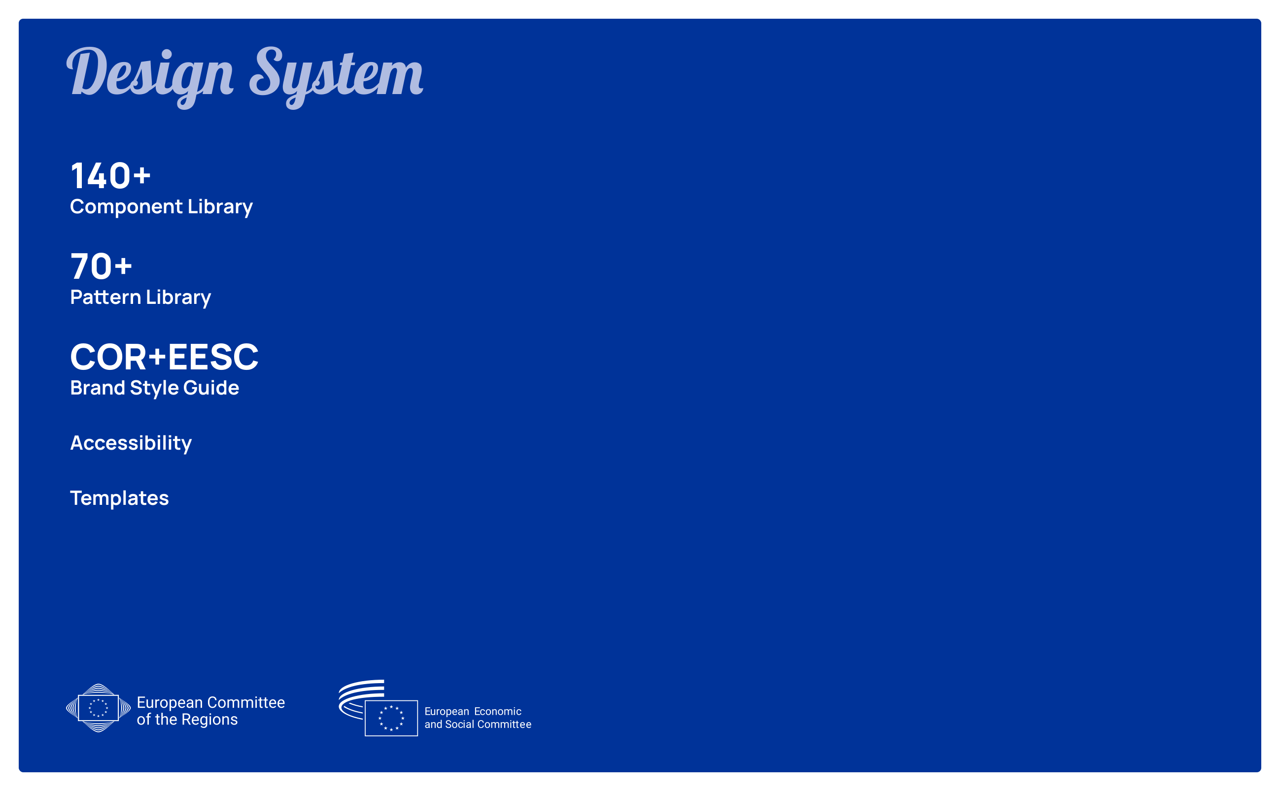
The index screen maps all 140+ components into structured categories: navigation elements, form controls, data display patterns, feedback components (alerts, toasts, modals), and layout primitives. Each entry shows its ECL token reference, accessibility status, and usage context. The EU blue gradient background (#003399 → #0066CC) reinforces institutional brand identity across all surfaces.
Why a unified design system?
Before this system, COR and EESC digital products were built in silos, inconsistent spacing, diverging interaction patterns, and no shared accessibility baseline. Each team reinvented components from scratch, creating friction for both users and developers.
The system introduced a single source of truth: one component, one token, one accessibility standard. Development time for new interfaces dropped significantly, and EU digital compliance became an automatic outcome.
My process
-
01
Audit & inventory
Catalogued existing UI across all institutional products, identifying duplication, inconsistencies, and accessibility gaps.
-
02
Token architecture
Defined design tokens for colour, spacing, typography, and border radiusM mapped directly to ECL variables and Figma styles.
-
03
Component build & spec
Built each component in Figma with interactive states, then authored ARIA specs and React/Angular prop tables for dev handoff.
-
04
Accessibility validation
Each component tested with axe, WAVE, Stark contrast analyser, and manual screen reader testing before release.
-
05
Governance & adoption
Embedded the system into development workflows via Storybook, with contribution guidelines and versioned changelog.
Typography & Colour System
This section merges the European font family styleguide and the colour system into a single design reference for institutional UI. It codifies the typographic system for the European institutional family, covering the complete type scale from display headings to caption text, the authorised font stack with fallbacks for system rendering, line-height and letter-spacing rules for each level, and minimum contrast ratios per WCAG 2.2 AA. It also documents the primary institutional palette (#003399 EU blue), semantic colours for status states, and the accessible teal accent (#11998E) used for interactive affordances. Each swatch includes its hex value, APCA contrast score, and approved use cases so designers and developers can apply colour consistently and accessibly.

This styleguide codifies the full typographic system for institutional digital products, with a complete type scale, approved font stack, responsive spacing rules, and WCAG 2.2 AA contrast requirements.

The colour palette defines institutional brand colours, semantic state colours, and neutral scales with accessible contrast guidance for text, controls, and background use.
Typographic decisions
The European institutional font family was selected for maximum legibility across languages, critical in multilingual EU environments where the same interface must render in 24 official languages, including scripts with ascenders, descenders, and diacritics uncommon in Western Latin text.
Type scale was defined in relative units (rem) to respect user browser settings, a WCAG 2.2 requirement that many institutional systems failed before this work.
Outcomes & impact
-
→
WCAG 2.2 AA baseline
All 140+ components ship compliant. First time COR/EESC digital products met EN 301 549 from day one.
-
→
Faster delivery
Dev teams building new features no longer rebuild shared UI, component reuse cut interface build time significantly.
-
→
Cross-institution consistency
COR and EESC digital products share a unified visual language for the first time, reinforcing institutional credibility.
-
→
Living documentation
Storybook-hosted component library gives developers interactive docs, accessible by all teams without Figma access.