← Back to portfolio

Digital workplace · Microsoft 365 · CoR & EESC

Legacy to Microsoft 365

  • SharePoint
  • Power BI
  • Outlook
  • Word
  • PowerPoint
UX/UI, information architecture & templates
Intranet pages mapped
300+
New SharePoint sites
50+
Page templates
Directorate, unit, topic
Brands
CoR, EESC & joint services

Outcome

Old custom intranets and apps replaced with standard Microsoft tools that still look and feel like the Committees

The Committees ran old, custom-built intranets and applications. They were costly to maintain and each one looked different. The decision was to move to Microsoft 365: intranets to SharePoint Online, reports and dashboards to Power BI, and communication to Outlook, Word and PowerPoint.

My part was to make sure the move did not lose the brand or the usability. I applied the CoR & EESC design system to every Microsoft product: SharePoint page templates and site navigation, Power BI dashboards, Outlook email templates, and Word and PowerPoint templates.

Standard tools, without losing the Committees’ identity

Moving to Microsoft 365 cuts custom code and maintenance. The risk is a plain, generic intranet that nobody recognises, and teams building pages and reports their own way. A shared design layer on top of Microsoft fixes both.

Before

  • Custom intranets and web apps, each with its own look.
  • Hundreds of pages with deep, inconsistent menus.
  • Reports built by hand or in old tools.
  • Emails and documents formatted differently by each team.

After

  • SharePoint Online sites from three reusable page templates.
  • One top menu for the whole intranet.
  • Power BI dashboards with Committee colours and layout.
  • Ready-made Outlook, Word and PowerPoint templates.

Who it is for

  • Staff and members: find people, news and services fast.
  • Site owners in each unit: publish pages without design skills.
  • Managers: follow opinions and plenaries in one dashboard.
  • Communication teams: send on-brand newsletters.

Replace legacy systems with Microsoft products, step by step

What moved where.
LegacyMicrosoft 365Design work
Custom intranet sitesSharePoint OnlineSite navigation, page templates (directorate, unit, topic), header, footer, SharePoint admin set-up
Custom reporting appsPower BIDashboard templates like Opinions: KPI cards, commission colours, filters, lists
Hand-made newslettersOutlookHTML email template for the DIIT newsletter, with both Committee logos
Unbranded documents and slidesWord & PowerPointTemplates with brand colours, styles, header and footer
  1. 1InventoryList every legacy page and app, with its owner and old URL.
  2. 2MapGive each page a level and a new SharePoint site in the new structure.
  3. 3TemplatesDesign directorate, unit and topic pages from the design system.
  4. 4BuildSet up sites, navigation and web parts in SharePoint admin.
  5. 5MigrateUnit owners move their content into the templates.
  6. 6ExtendApply the same system to Power BI, Outlook, Word and PowerPoint.

300+ old pages into a clear structure

The inventory listed every page of the old EESC intranet with its old URL and new SharePoint site, up to six levels deep. The new structure keeps the top menu short and pushes detail down to unit and topic pages.

HomeSecretary-GeneralDirectoratesPresident & CabinetMembers

Level 2 · Directorate site

Directorate A–E

News, role of the directorate, its units, contact

Level 3 · Unit site

General coordination, Unit 1, Unit 2…

What the unit does, topics, who does what, contact

Level 4 · Topic page

Plenary sessions, Interpretation, Web accessibility…

Title, text, image, documents, contact

Decisions

  • No mega menu: five top items, the rest one click down.
  • Every page type has one template, so sites look the same.
  • Footer holds help: IT service desk, security, facilities, medical service.
  • Quick links replace the old “web applications” panel.

Footer & extras

  • Need help? Security, IT helpdesk, facilities, medical service, IT forms.
  • About this intranet: accessibility, site map, data protection, governance, SharePoint tutorials.
  • Moved, not lost: vacancies under HR, staff regulations and procedures under one page.

One design system, five Microsoft products

Same blue (#2C4390), same logos, same type hierarchy and spacing everywhere. Images use sample content; names and contact details are hidden.
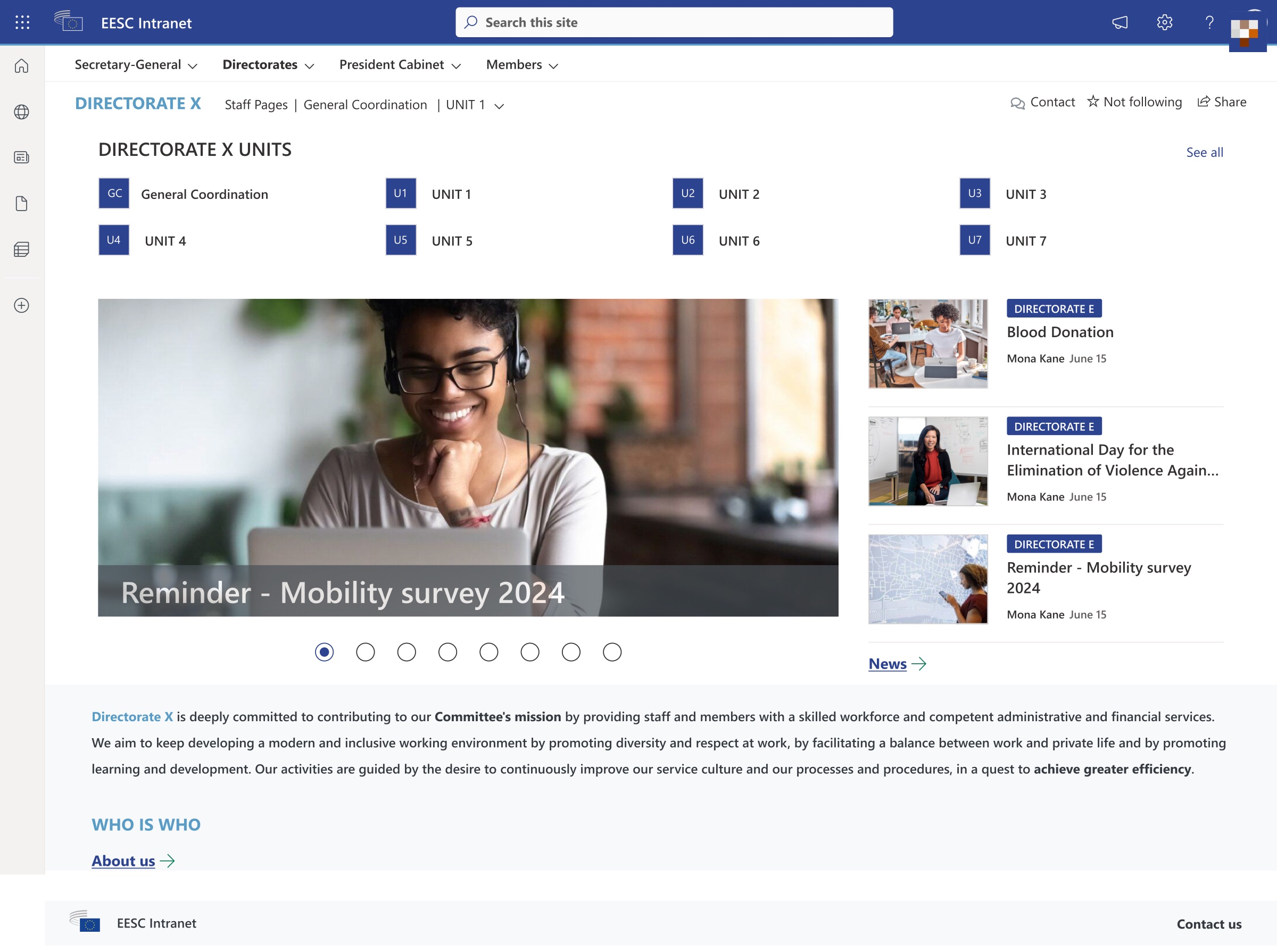
SharePoint directorate page template with the EESC Intranet header, top menu, unit tiles, news carousel and description
Directorate pageUnits as tiles, a news carousel with the latest posts, and the role of the directorate.
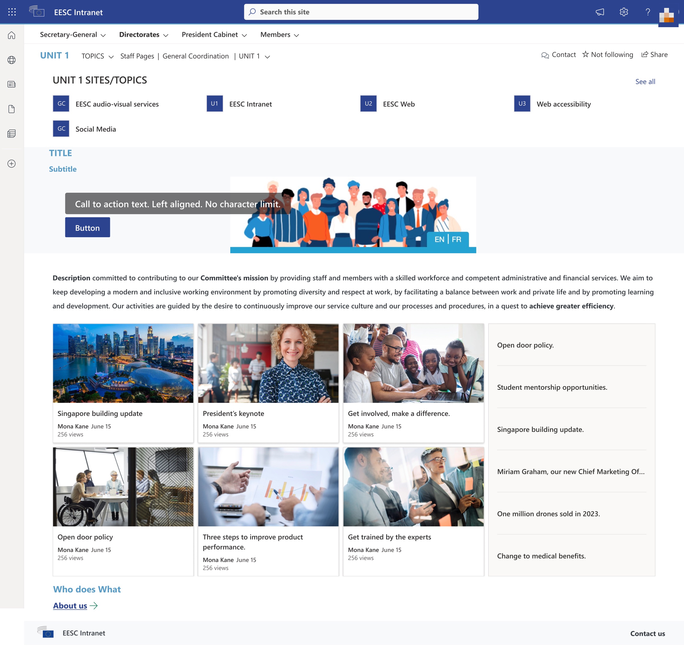
SharePoint unit page template with topic tiles, a hero with a call to action, news cards and a quick links list
Unit pageTopic tiles, a hero with one call to action, news cards and quick links, then “Who does what”.

SharePoint admin & UI

  • Site theme in the Committee colours, with the EESC logo in the suite bar.
  • One top menu shared by every site.
  • Unit codes (GC, U1, U2…) as tiles, so people recognise their unit fast.
  • Standard web parts only: news, quick links, hero, people. No custom code to maintain.

Made for site owners

  • Templates with clear placeholders: “Title”, “Subtitle”, “Call to action text”.
  • Language switch (EN | FR) on the hero.
  • Owners fill in content; layout and brand stay fixed.
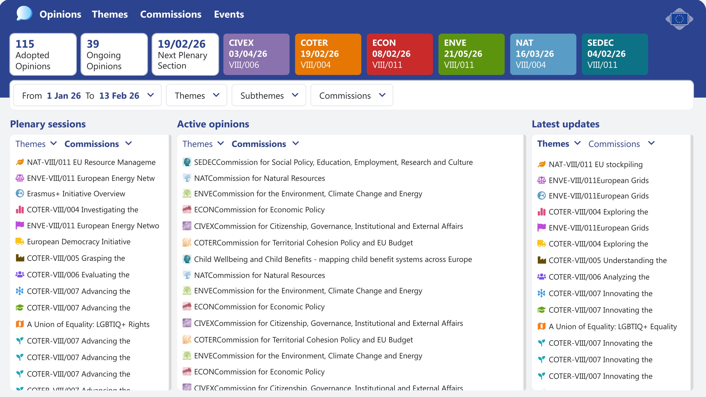
Opinions dashboard with KPI cards for adopted and ongoing opinions, next plenary, commission cards in their colours, filters and lists of plenary sessions, active opinions and latest updates
Opinions dashboardKPI cards first, one card per commission in its colour with the next date, then filters and three lists. The same layout works for other dashboards.
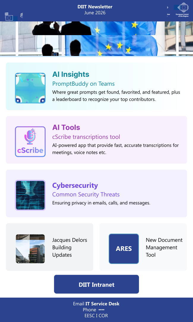
DIIT newsletter email template with both Committee logos, a hero image, three feature blocks for AI insights, AI tools and cybersecurity, two news tiles, a button and a footer
  • 650px wide, the safe width for Outlook and mobile mail apps.
  • Both Committee logos in the header, so it is clearly a joint service.
  • Each story in its own block with an icon, a title and one line of text.
  • One main button: “DIIT Intranet”, linking to SharePoint.
  • Help contact in the footer.
Word template footer: DIIT Digital Platforms on the left, the SharePoint, CoR and EESC web addresses on the right, separated by a thin yellow line
Word footerTeam name, a thin EU-yellow line and the three web addresses. PowerPoint templates use the same colours and type styles.

Are the templates easy to use, and accessible to everyone?

I reviewed the design against the 10 usability rules of Nielsen Norman Group and the WCAG 2.2 AA accessibility standard. Each row shows how the design answers each rule.

Usability review of the Microsoft 365 templates.
Usability ruleHow the design answers itTo check in testing
Consistency and standardsSame header, colours and page structure on every site, dashboard and email.Do staff know where they are when they move between sites?
Recognition rather than recallUnit codes as tiles, “Who does what” on every unit page, quick links on the side.Can people find a colleague’s unit without search?
Aesthetic and minimalist designFive top menu items, no mega menu. Dashboards show KPIs first.Is anything important hidden one level too deep?
Visibility of system statusPower BI shows the date range and the next plenary. Lists show the latest updates.Do managers trust the numbers are up to date?
AccessibilityWhite text on #2C4390 (9.1:1). Commission colours always come with the commission name. Standard SharePoint web parts keep keyboard support.Contrast of commission cards, alt text in news, email read aloud by screen readers.

Test plan

Status: plan. Tree tests on the new structure, then task-based sessions on the templates with staff and site owners. Results will replace this plan.

Tasks and success criteria.
TaskMethodSuccess means
“Where would you book a meeting room?”Tree test on the new menuMost people pick the right branch first time.
“Find who handles plenary sessions.”Task on a unit pageFound through “Who does what” without search.
“Publish a news post on your unit site.”Task with site ownersDone without help, layout unchanged.
“Which commission has the next deadline?”Task on the Power BI dashboardCorrect answer from the commission cards.

What I delivered, and what comes next

Delivered

  • Information architecture for the new EESC intranet: 300+ pages mapped to 50+ SharePoint sites.
  • SharePoint directorate, unit and topic page templates, navigation and footer.
  • Power BI dashboard templates, starting with Opinions.
  • Outlook newsletter template, Word and PowerPoint templates.

Next steps

  • Run the tree test and template tasks.
  • Write a short guide for site owners.
  • Extend the templates to CoR sites and more dashboards.

See the CoR & EESC design system